|
A sprint down memory lane--it's paved, so watch out for the skid check PSR! 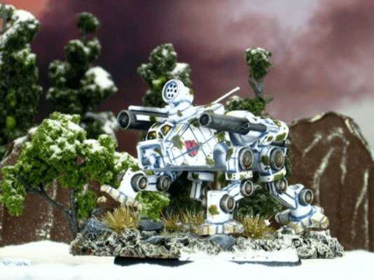 The Xanthos is a cool piece--if for no other reason that I managed my way into the fiction as a notable pilot for it! There is something about the change of the seasons that makes me want to paint different units, schemes, and bases. Spring and summer in Oklahoma usually means deserts inspired by the dry red dirt and yellow grasses. Fall turns into darker color pallets like Night Stalkers on undead-like or harvest-style bases. Winter means snow camo, frost covered bases, and Lyrans and Ghost Bears galore! This Xanthos started with an all over white primer and base coat. Like the Thunderbolt from last week, I used layers of lining to give it contrast. While I could have used brown or tan to shade again--and this would have emphasized the camo nature of the piece--I went with blue grey to bring out the feeling of coldness for the snow Effects. For this piece, watered down light grey blue (Ghost Grey) with a size 1 brush. This was followed by a medium grey blue with a size 0 brush. The final round was a dark blue grey (Shadow Grey) with a size 000 brush in only the darkest parts. 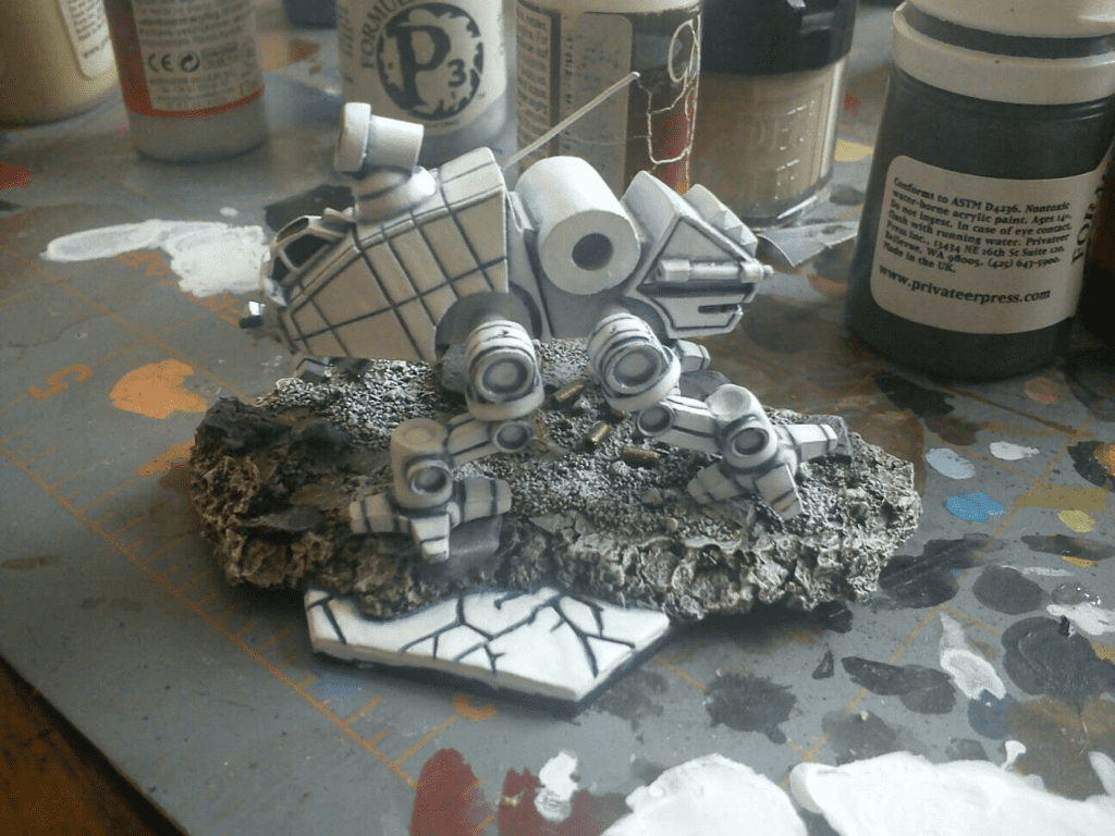 The camo was a pretty cool trick using an old dry brush with split ends and curled bristles. I wanted a thin, tan outline of each splotch, so I started with that color. With most of the paint wiped off the brush, I stippled it (read "STABBED THE MINIATURE WITH A PAINT BRUSH!") onto the mini. It's important to remember that when painting camo miniatures, if you make it too camo, it will do just that and hide the details. After the initial stippling, I went back and carefully filled each splotch with dark green, making sure to leave the tan outline visible. In the very center of each splotch, I then added medium and light green to add a sense of shading. 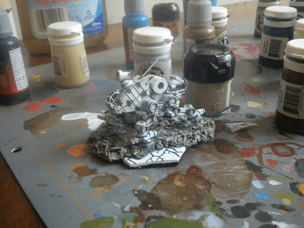 For the cockpit, I wanted a color that would go well with the other colors in the piece. Since it is white (a neutral color), with blue shading (a cool color, a primary color, and a compliment to orange) and tan/green camo splotches (relatively cool colors with the dominant green, a secondary color, and a compliment to red), and knowing that I wanted to highlight the red in the Highlanders' logo (a warm color, a primary color, and a compliment to green), I chose a golden yellow. With this same logic, I chose the same yellow and red pattern of the MacLeod tartan for the major swatch. 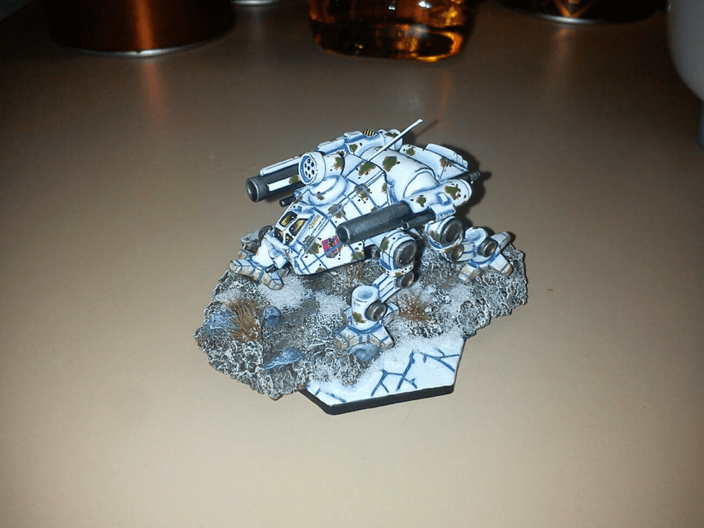 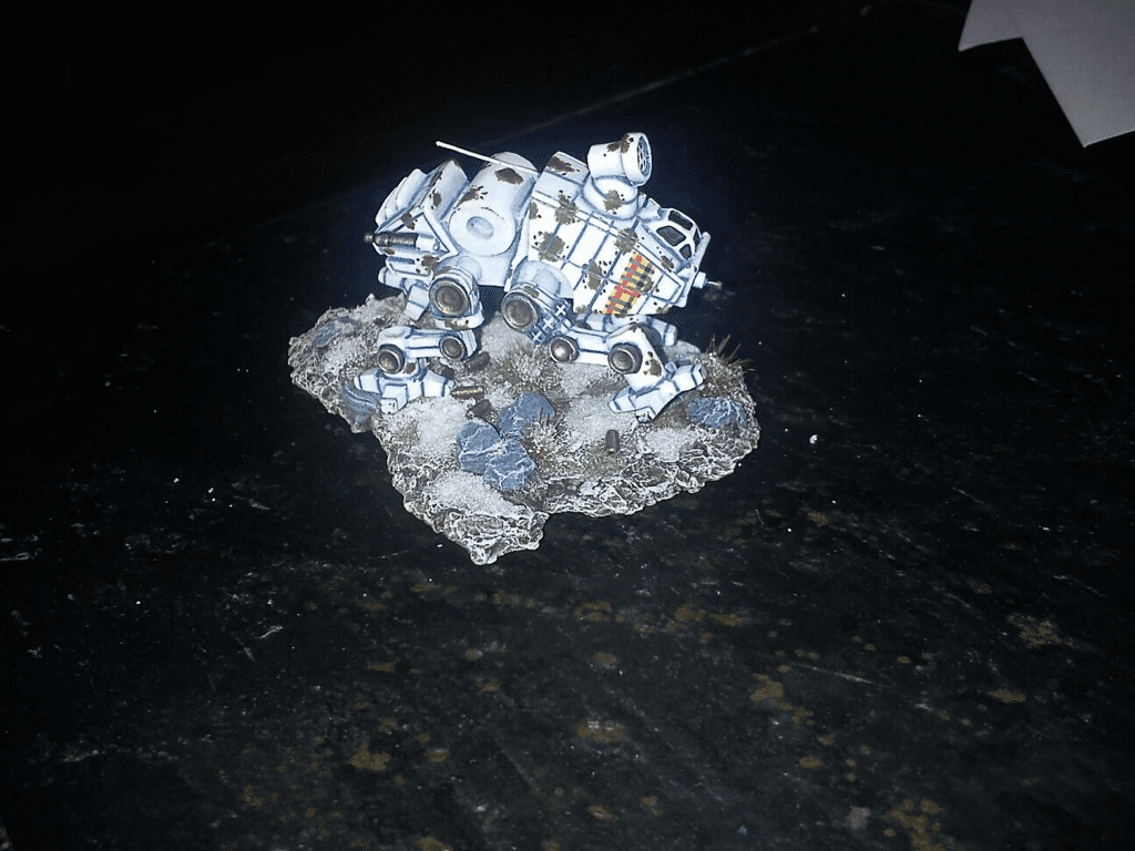 The remaining details, metallics, weathering, etc., were done in the same way as most of my work. I did, however, want to keep the number of non-camo elements to a minimum to emphasize the overall pattern.
Do you have a favorite winter camo scheme or your own tricks to paint white? Share them in the comments below!
2 Comments
1/4/2023 05:53:42 pm
100 tl deneme bonusu veren siteleri öğrenmek istiyorsan tıkla. Leave a Reply. |
Cap'n EdTutorials and Projects Archives
January 2018
Categories
All
|
Cap’n Ed’s ’Mech Hangar
 RSS Feed
